diagrams with React Flow
published: 12/8/2025
written by: Stefan Johansson
11 min read
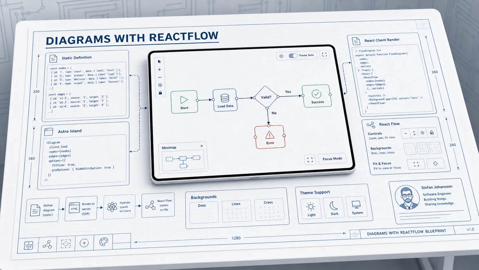
React Flow is a powerful open-source library for building interactive diagrams and flowcharts in React (or Svelte) applications.
This post demonstrates React Flow diagramming in Astro. These diagrams are fully client-side rendered, making them perfect for a static site hosted on Azure Static Web Apps.
While React Flow supports extensive interactivity and diagram creation, including node and edge creation, dragging, zooming, and panning, this post focuses on static diagrams with optional interactivity. This allows a site to publish pre-defined diagrams that can be nicely rendered and explored, without the diagram creation features being front and center.
The component exposes the diagram as an Astro React island, allowing easy integration into Astro pages and posts. A trivial diagram definition is passed as a prop to the component, which then renders the diagram accordingly.
Simple Flow Diagram
Here’s a basic flow diagram showing a simple process:
Click the expand button in the top-right corner to enter focus mode for a larger/better/focus view of the diagram!
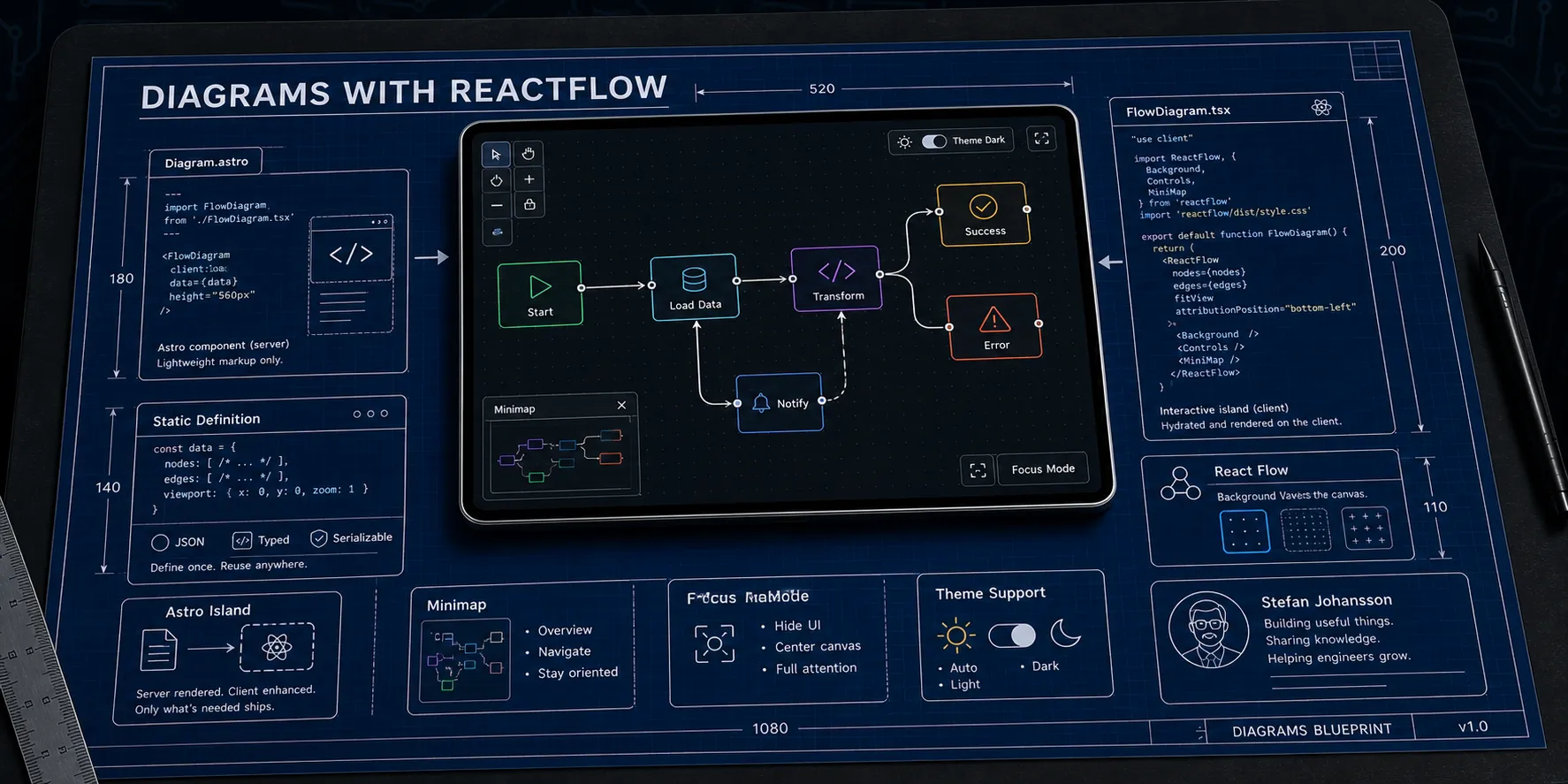
Architecture Diagram
More complex diagrams can show system architectures with multiple branches:
Different Background Styles
The diagram component should support different background patterns:
Cross Pattern
Configuration Options
The Diagram component accepts several configuration options:
- definition - The diagram definition (nodes and edges)
- title - Optional title displayed above the diagram
- height - Height of the diagram container (default: 400px)
- showMiniMap - Whether to show the mini map (default: false)
- showControls - Whether to show zoom/pan controls (default: true)
- backgroundVariant - ‘dots’, ‘lines’, or ‘cross’ (default: ‘dots’)
- allowFocusMode - Enable fullscreen focus mode (default: true)
- interactive - Allow node dragging (default: false)
- fitView - Auto-fit diagram to view (default: true)
Theme Support
The diagrams automatically adapt to the site’s theme. Try switching between light and dark mode using the theme toggle in the footer to see the diagrams adjust their colors accordingly!
All diagrams are rendered entirely client-side, making them perfect for static site hosting. No server-side processing is required.
Component code
While this code will work as shown in this post, one can also use the @sjohansson/astro-reactflow package to create custom diagrams with React Flow in Astro. The package provides a ReactFlowWrapper component that possibly simplifies an implementation.
File: Diagram.astro
A nifty Astro component that wraps the React Flow diagram and exposes it as an easy-to-use component for Astro pages and posts:
---
import type { DiagramDefinition } from "./FlowDiagram.tsx";
import FlowDiagram from "./FlowDiagram.tsx";

export interface Props {
  /** The diagram definition - can be a JSON string or object */
  definition: DiagramDefinition | string;
  /** Optional title displayed above the diagram */
  title?: string;
  /** Height of the diagram container (default: 400) */
  height?: string | number;
  /** Whether to show the mini map (default: false) */
  showMiniMap?: boolean;
  /** Whether to show controls (default: true) */
  showControls?: boolean;
  /** Background variant: 'dots', 'lines', 'cross' (default: 'dots') */
  backgroundVariant?: "dots" | "lines" | "cross";
  /** Whether to allow focus/fullscreen mode (default: true) */
  allowFocusMode?: boolean;
  /** Whether nodes can be dragged (default: false for static display) */
  interactive?: boolean;
  /** Fit view on load (default: true) */
  fitView?: boolean;
  /** Additional CSS class for the container */
  class?: string;
  /** Default arrow marker for all edges: 'arrow', 'arrowclosed', or false (default: false) */
  defaultMarkerEnd?: "arrow" | "arrowclosed" | boolean;
  /** Default stroke width for all edges (default: 2) */
  defaultStrokeWidth?: number;
}

const {
  definition,
  title,
  height = 400,
  showMiniMap = false,
  showControls = true,
  backgroundVariant = "dots",
  allowFocusMode = true,
  interactive = false,
  fitView = true,
  class: className = "",
  defaultMarkerEnd = false,
  defaultStrokeWidth = 2,
} = Astro.props;
---

<div class="flow-diagram-wrapper my-6">
  <FlowDiagram
    client:only="react"
    definition={definition}
    title={title}
    height={height}
    showMiniMap={showMiniMap}
    showControls={showControls}
    backgroundVariant={backgroundVariant}
    allowFocusMode={allowFocusMode}
    interactive={interactive}
    fitView={fitView}
    className={className}
    defaultMarkerEnd={defaultMarkerEnd}
    defaultStrokeWidth={defaultStrokeWidth}
  />
</div>
File: FlowDiagram.tsx
Main logic runs in React, so that needs to be available in the site.
import {
  addEdge,
  Background,
  BackgroundVariant,
  type ColorMode,
  Controls,
  type Edge,
  MarkerType,
  MiniMap,
  type Node,
  type OnConnect,
  Panel,
  ReactFlow,
  ReactFlowProvider,
  useEdgesState,
  useNodesState,
  useReactFlow,
  type Viewport,
} from "@xyflow/react";
import "@xyflow/react/dist/style.css";
import type { CSSProperties } from "react";
import { useCallback, useEffect, useId, useMemo, useState } from "react";

/**
 * Node definition for diagram configuration
 */
export interface DiagramNode {
  id: string;
  type?: "default" | "input" | "output" | "group" | string;
  label: string;
  position: { x: number; y: number };
  style?: CSSProperties;
  className?: string;
  parentId?: string;
  extent?: "parent";
}

/**
 * Edge definition for diagram configuration
 */
export interface DiagramEdge {
  id: string;
  source: string;
  target: string;
  label?: string;
  type?: "default" | "straight" | "step" | "smoothstep" | "bezier";
  animated?: boolean;
  style?: CSSProperties;
  markerEnd?: "arrow" | "arrowclosed" | boolean;
  /** Stroke width for this edge (overrides diagram default) */
  strokeWidth?: number;
}

/**
 * Complete diagram definition that can be passed as JSON
 */
export interface DiagramDefinition {
  nodes: DiagramNode[];
  edges: DiagramEdge[];
  title?: string;
  description?: string;
}

/**
 * Props for the FlowDiagram component
 */
export interface FlowDiagramProps {
  /** The diagram definition as JSON or parsed object */
  definition: DiagramDefinition | string;
  /** Optional title displayed above the diagram */
  title?: string;
  /** Height of the diagram container (default: 400px) */
  height?: string | number;
  /** Whether to show the mini map (default: true) */
  showMiniMap?: boolean;
  /** Whether to show controls (default: true) */
  showControls?: boolean;
  /** Background variant: 'dots', 'lines', 'cross' (default: 'dots') */
  backgroundVariant?: "dots" | "lines" | "cross";
  /** Whether to allow focus/fullscreen mode (default: true) */
  allowFocusMode?: boolean;
  /** Whether nodes can be dragged (default: false for static display) */
  interactive?: boolean;
  /** Fit view on load (default: true) */
  fitView?: boolean;
  /** Additional CSS class for the container */
  className?: string;
  /** Default arrow marker for all edges: 'arrow', 'arrowclosed', or false (default: false) */
  defaultMarkerEnd?: "arrow" | "arrowclosed" | boolean;
  /** Default stroke width for all edges (default: 2) */
  defaultStrokeWidth?: number;
}

/**
 * Internal component that renders the React Flow diagram
 */
function FlowDiagramInner({
  definition,
  title,
  height = 400,
  showMiniMap = false,
  showControls = true,
  backgroundVariant = "dots",
  allowFocusMode = true,
  interactive = false,
  fitView = true,
  className = "",
  defaultMarkerEnd = false,
  defaultStrokeWidth = 2,
}: FlowDiagramProps) {
  const [isFocusMode, setIsFocusMode] = useState(false);
  const [colorMode, setColorMode] = useState<ColorMode>("light");
  const [savedViewport, setSavedViewport] = useState<Viewport | null>(null);

  // Get React Flow instance for viewport control
  const { fitView: fitViewFn, getViewport, setViewport } = useReactFlow();

  // Generate unique ID for this diagram instance (needed for multiple diagrams on same page)
  const diagramId = useId();

  // Map string background variant to React Flow enum
  const bgVariant = useMemo(() => {
    switch (backgroundVariant) {
      case "lines":
        return BackgroundVariant.Lines;
      case "cross":
        return BackgroundVariant.Cross;
      default:
        return BackgroundVariant.Dots;
    }
  }, [backgroundVariant]);

  // Parse definition if it's a string
  const parsedDefinition: DiagramDefinition = useMemo(() => {
    if (typeof definition === "string") {
      try {
        return JSON.parse(definition);
      } catch (e) {
        console.error("Failed to parse diagram definition:", e);
        return { nodes: [], edges: [] };
      }
    }
    return definition;
  }, [definition]);

  // Convert diagram nodes to React Flow nodes
  const initialNodes: Node[] = useMemo(() => {
    return parsedDefinition.nodes.map((node) => ({
      id: node.id,
      type: node.type || "default",
      position: node.position,
      data: { label: node.label },
      style: node.style,
      className: node.className,
      parentId: node.parentId,
      extent: node.extent,
      // Provide measured dimensions for minimap rendering
      measured: { width: 150, height: 40 },
    }));
  }, [parsedDefinition.nodes]);

  // Convert diagram edges to React Flow edges
  const initialEdges: Edge[] = useMemo(() => {
    return parsedDefinition.edges.map((edge) => {
      // Determine stroke width (per-edge override or diagram default)
      const strokeWidth = edge.strokeWidth ?? defaultStrokeWidth;

      const reactFlowEdge: Edge = {
        id: edge.id,
        source: edge.source,
        target: edge.target,
        label: edge.label,
        type: edge.type || "smoothstep",
        animated: edge.animated,
        style: { ...edge.style, strokeWidth },
      };

      // Determine marker: per-edge setting takes precedence, then diagram default
      const markerSetting = edge.markerEnd !== undefined ? edge.markerEnd : defaultMarkerEnd;

      // Convert markerEnd to proper React Flow format
      if (markerSetting === "arrow") {
        reactFlowEdge.markerEnd = { type: MarkerType.Arrow };
      } else if (markerSetting === "arrowclosed" || markerSetting === true) {
        reactFlowEdge.markerEnd = { type: MarkerType.ArrowClosed };
      }

      return reactFlowEdge;
    });
  }, [parsedDefinition.edges, defaultMarkerEnd, defaultStrokeWidth]);

  // eslint-disable-next-line @typescript-eslint/no-unused-vars, no-unused-vars
  const [nodes, _setNodes, onNodesChange] = useNodesState(initialNodes);
  const [edges, setEdges, onEdgesChange] = useEdgesState(initialEdges);

  // Use static edges for non-interactive diagrams
  const edgesToRender = interactive ? edges : initialEdges;

  // Handle theme changes by watching data-theme attribute
  useEffect(() => {
    const updateTheme = () => {
      const theme = document.documentElement.getAttribute("data-theme");
      if (theme === "dark" || theme === "high-contrast-dark") {
        setColorMode("dark");
      } else {
        setColorMode("light");
      }
    };

    // Initial check
    updateTheme();

    // Watch for theme changes
    const observer = new MutationObserver((mutations) => {
      for (const mutation of mutations) {
        if (mutation.attributeName === "data-theme") {
          updateTheme();
        }
      }
    });

    observer.observe(document.documentElement, {
      attributes: true,
      attributeFilter: ["data-theme"],
    });

    return () => observer.disconnect();
  }, []);

  // Handle connections (only if interactive)
  const onConnect: OnConnect = useCallback(
    (params) => {
      if (interactive) {
        setEdges((eds) => addEdge(params, eds));
      }
    },
    [interactive, setEdges],
  );

  // Toggle focus mode
  const toggleFocusMode = useCallback(() => {
    if (!isFocusMode) {
      // Entering focus mode - save current viewport and fit view after animation
      setSavedViewport(getViewport());
      document.body.style.overflow = "hidden";
      setIsFocusMode(true);
      // Fit view shortly after the container is fixed positioned (animation is 250ms)
      setTimeout(() => {
        fitViewFn({ padding: 0.15, duration: 400 });
      }, 100);
    } else {
      // Exiting focus mode - restore saved viewport
      document.body.style.overflow = "";
      // First restore the viewport, then exit focus mode
      if (savedViewport) {
        setViewport(savedViewport, { duration: 300 });
      }
      setTimeout(() => {
        setIsFocusMode(false);
      }, 50);
    }
  }, [isFocusMode, getViewport, setViewport, fitViewFn, savedViewport]);

  // Clean up body overflow on unmount
  useEffect(() => {
    return () => {
      document.body.style.overflow = "";
    };
  }, []);

  // Handle escape key to exit focus mode
  useEffect(() => {
    const handleKeyDown = (e: KeyboardEvent) => {
      if (e.key === "Escape" && isFocusMode) {
        toggleFocusMode();
      }
    };

    if (isFocusMode) {
      window.addEventListener("keydown", handleKeyDown);
      return () => window.removeEventListener("keydown", handleKeyDown);
    }
  }, [isFocusMode, toggleFocusMode]);

  const diagramTitle = title || parsedDefinition.title;
  const focusButtonLabel = isFocusMode ? "Exit focus mode (Esc)" : "Enter focus mode";

  const containerClasses = isFocusMode
    ? "flow-diagram-container flow-diagram-focus-mode"
    : `flow-diagram-container ${className}`;

  // Only set height for non-focus mode; focus mode uses CSS
  const containerStyle: CSSProperties = isFocusMode
    ? {}
    : {
        height: typeof height === "number" ? `${height}px` : height,
        width: "100%",
      };

  return (
    <div className={containerClasses} style={containerStyle}>
      {diagramTitle && !isFocusMode && <div className="flow-diagram-title">{diagramTitle}</div>}
      <ReactFlow
        nodes={nodes}
        edges={edgesToRender}
        onNodesChange={interactive ? onNodesChange : undefined}
        onEdgesChange={interactive ? onEdgesChange : undefined}
        onConnect={interactive ? onConnect : undefined}
        fitView={fitView}
        colorMode={colorMode}
        nodesDraggable={interactive}
        nodesConnectable={interactive}
        elementsSelectable={interactive}
        panOnDrag={true}
        zoomOnScroll={true}
        proOptions={{ hideAttribution: true }}
      >
        <Background
          id={`bg-${diagramId}`}
          variant={bgVariant}
          gap={bgVariant === BackgroundVariant.Dots ? 25 : 25}
          size={bgVariant === BackgroundVariant.Dots ? 1 : bgVariant === BackgroundVariant.Cross ? 6 : 1}
          color={
            bgVariant === BackgroundVariant.Lines
              ? colorMode === "dark"
                ? "rgba(255, 255, 255, 0.05)"
                : "rgba(0, 0, 0, 0.05)"
              : undefined
          }
        />
        {showControls && <Controls showInteractive={false} />}
        {showMiniMap && (
          <MiniMap
            nodeStrokeWidth={1}
            nodeBorderRadius={3}
            zoomable
            pannable
            nodeColor={(node) => {
              // Use different colors based on node type
              if (node.type === "input") return "#3b82f6";
              if (node.type === "output") return "#10b981";
              return "#6b7280";
            }}
            nodeStrokeColor="#374151"
            maskColor="rgba(0, 0, 0, 0.2)"
            bgColor="var(--blog-chrome-surface-color)"
          />
        )}
        {allowFocusMode && (
          <Panel position="top-right" className="flow-diagram-panel">
            {isFocusMode && diagramTitle && <span className="flow-diagram-focus-title">{diagramTitle}</span>}
            <button
              type="button"
              onClick={toggleFocusMode}
              className="flow-diagram-focus-button"
              title={focusButtonLabel}
              aria-label={focusButtonLabel}
            >
              {isFocusMode ? (
                <svg
                  xmlns="http://www.w3.org/2000/svg"
                  width="20"
                  height="20"
                  viewBox="0 0 24 24"
                  fill="none"
                  stroke="currentColor"
                  strokeWidth="2"
                  strokeLinecap="round"
                  strokeLinejoin="round"
                >
                  <title>{focusButtonLabel}</title>
                  <path d="M8 3v3a2 2 0 0 1-2 2H3" />
                  <path d="M21 8h-3a2 2 0 0 1-2-2V3" />
                  <path d="M3 16h3a2 2 0 0 1 2 2v3" />
                  <path d="M16 21v-3a2 2 0 0 1 2-2h3" />
                </svg>
              ) : (
                <svg
                  xmlns="http://www.w3.org/2000/svg"
                  width="20"
                  height="20"
                  viewBox="0 0 24 24"
                  fill="none"
                  stroke="currentColor"
                  strokeWidth="2"
                  strokeLinecap="round"
                  strokeLinejoin="round"
                >
                  <title>{focusButtonLabel}</title>
                  <path d="M8 3H5a2 2 0 0 0-2 2v3" />
                  <path d="M21 8V5a2 2 0 0 0-2-2h-3" />
                  <path d="M3 16v3a2 2 0 0 0 2 2h3" />
                  <path d="M16 21h3a2 2 0 0 0 2-2v-3" />
                </svg>
              )}
            </button>
          </Panel>
        )}
      </ReactFlow>
      {parsedDefinition.description && !isFocusMode && (
        <div className="flow-diagram-description">{parsedDefinition.description}</div>
      )}
    </div>
  );
}

/**
 * FlowDiagram component for rendering React Flow diagrams in Astro
 *
 * @example
 * ```tsx
 * <FlowDiagram
 *   definition={{
 *     nodes: [
 *       { id: '1', label: 'Start', position: { x: 0, y: 0 }, type: 'input' },
 *       { id: '2', label: 'Process', position: { x: 0, y: 100 } },
 *       { id: '3', label: 'End', position: { x: 0, y: 200 }, type: 'output' }
 *     ],
 *     edges: [
 *       { id: 'e1-2', source: '1', target: '2' },
 *       { id: 'e2-3', source: '2', target: '3' }
 *     ]
 *   }}
 *   title="My Flow Diagram"
 *   height={500}
 * />
 * ```
 */
export default function FlowDiagram(props: FlowDiagramProps) {
  return (
    <ReactFlowProvider>
      <FlowDiagramInner {...props} />
    </ReactFlowProvider>
  );
}
File: index.ts
And, a helper file in the component directory for good measure
// Re-export diagram components and types for easy importing

export type { DiagramDefinition, DiagramEdge, DiagramNode, FlowDiagramProps } from "./FlowDiagram.tsx";
export { default as FlowDiagram } from "./FlowDiagram.tsx";