astro components
published: 6/7/2026
written by: Stefan Johansson
5 min read

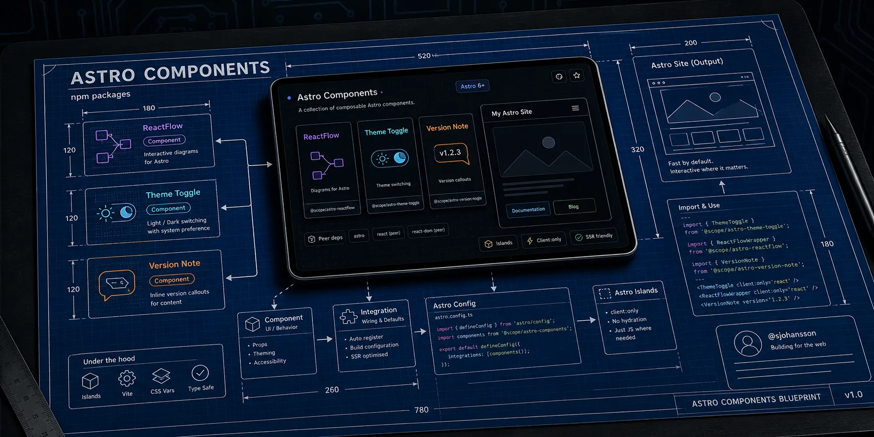
Astro Components is a small collection of reusable packages built for Astro 6+. The goal is unglamorous but useful: take the pieces you end up rebuilding on every site — a diagram renderer, a theme switcher, a version note — and ship them as well-tested, self-contained npm packages you can drop in and forget about.
This post is the overview. It explains what is in the collection, the one design idea that ties the packages together, and how each one plugs into Astro. The two main components get their own deep dives:
- Diagrams in Astro with
@sjohansson/astro-reactflow— interactive flowcharts as Astro islands. - Theming and accessibility with
@sjohansson/astro-theme-toggle— light, dark, high-contrast, and color-vision themes.
What’s in the box
The collection is a pnpm monorepo that publishes three independent packages to npm:
| Package | What it does |
|---|---|
@sjohansson/astro-reactflow | Drop-in React Flow diagrams with a title bar, fullscreen focus mode, minimap, automatic theming, and PNG/SVG export. |
@sjohansson/astro-theme-toggle | An SSR-friendly theme system with light, dark, high-contrast, and color-vision modes, persisted across visits. |
@sjohansson/astro-version-note | A tiny callout for showing “what version is actually deployed and running here?”. |
Each package is fully isolated — no shared code, no cross-package imports — so you can install only the one you need and it carries its own weight.
The one idea: a component or an integration
Every package in the collection can be used two ways, and understanding this choice is most of what you need to know to use any of them.
As a component, you import it and place it in your markup like any other Astro component:
---
import { ThemeToggle } from '@sjohansson/astro-theme-toggle';
---

<ThemeToggle />
This is the zero-config path. It works immediately, with no changes to astro.config.mjs.
As an integration, you register it once in your Astro config:
// astro.config.mjs
import { defineConfig } from 'astro/config';
import themeToggle from '@sjohansson/astro-theme-toggle/integration';

export default defineConfig({
  integrations: [themeToggle()],
});
The integration does the wiring you would otherwise do by hand: injecting a pre-paint script to prevent a flash of the wrong theme, registering the React renderer for the diagram package, or applying the Vite settings React Flow needs during a build. The component still goes in your markup — the integration just makes sure the surrounding setup is correct.
Rule of thumb: reach for the component when you want something on the page right now, and add the integration when you want the package to manage its own setup (scripts, renderers, build config) for you.
Each export is namespaced so the two paths never collide — the component lives at the package root (@sjohansson/astro-theme-toggle) and the integration at the /integration subpath (@sjohansson/astro-theme-toggle/integration).
How it fits into Astro
A few design choices make these packages comfortable to live with in a real Astro project.
Peer dependencies, not bundled ones. Anything that has to be a single instance across your app — astro itself, and for the diagram package react, react-dom, @astrojs/react, and @xyflow/react — is declared as a peer dependency. You bring your own versions; the package slots into them. That keeps bundles lean and avoids the “two copies of React” class of bug.
Islands where they belong. The diagram package renders entirely in the browser as an Astro island. You opt in per usage with a client directive, so the rest of your page stays static HTML and only the interactive bits ship JavaScript. Static-site hosts like Azure Static Web Apps or GitHub Pages are a natural fit — there is no server to run.
SSR-friendly theming. The theme toggle resolves and persists the user’s choice and can replay it before the first paint, so pages render with the right colors immediately rather than flickering. More on that in the theme toggle post.
TypeScript throughout. Every package ships type definitions, so props are checked and autocompleted in your editor.
Installing
Install only what you need with your package manager of choice:
pnpm add @sjohansson/astro-theme-toggle
pnpm add @sjohansson/astro-reactflow @astrojs/react @xyflow/react react react-dom
pnpm add @sjohansson/astro-version-note
The theme toggle has no runtime dependencies. The diagram package leans on React and React Flow, which is why they appear alongside it — they are peers you install once and share across your site.
A quick look at the version note
The two headline packages get full posts of their own, so here is the third one in a single example. VersionNote is a small labelled callout for documentation that drifts with releases:
---
import { VersionNote } from '@sjohansson/astro-version-note';
---

<VersionNote version="v3.2.0" type="warning">
  This page documents features that changed in v3.2.0.
</VersionNote>
It takes a version label and a type (info, warning, success, or error), ships light and dark palettes, and has no runtime dependencies. Like the others, it can be registered as an integration if you want it to document and validate your conventions at build time.
Under the hood
For the curious, the monorepo is built with current tooling: pnpm workspaces, TypeScript in strict mode, Biome for linting and formatting, Vitest with happy-dom for tests, Changesets for versioning, and GitHub Actions for CI and publishing. Packages are bundled to ESM with type declarations, and CSS assets are emitted with content hashing. The source is public if you want to read along.
Where to next
- Diagrams in Astro with astro-reactflow — build interactive flowcharts with live examples you can drag and export.
- Theming and accessibility with astro-theme-toggle — the theme system that powers this very site.
This blog uses both of them, so the deep-dive posts double as a working demo.