astro theme toggle
published: 6/22/2026
written by: Stefan Johansson
7 min read
Most theme toggles do one thing: flip between light and dark. That covers the common case, but it leaves out readers who need more contrast, and it says nothing about color vision. @sjohansson/astro-theme-toggle treats theming as a small, well-defined problem and solves the whole of it for Astro 6+ sites — including the awkward parts, like making sure the page never flashes the wrong colors on load.
This post walks through what the package offers and how it is wired into Astro. It is also a working demo: this blog uses it, and the theme switcher in the footer is the very component described below. It is part of the Astro Components collection.
The problem
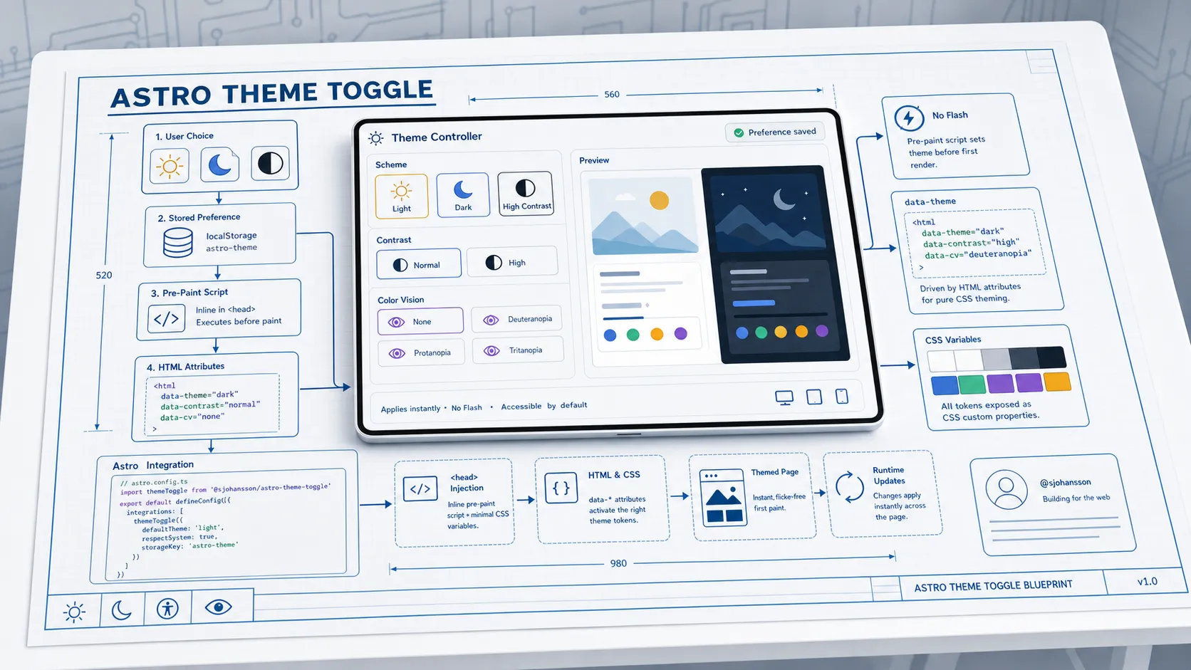
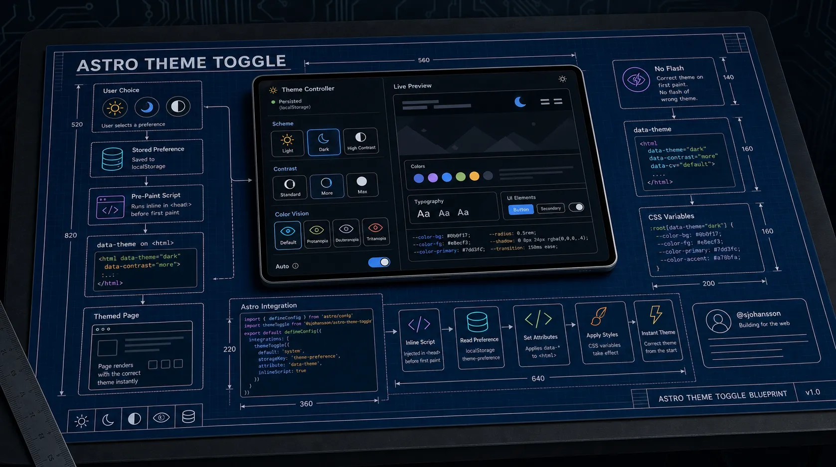
A good theme system has to answer at least four questions:
- What can the user choose? Light and dark, sure — but also a higher-contrast variant, and adjustments for different kinds of color vision.
- How is the choice remembered? It should survive reloads and navigation.
- How is the choice applied to your CSS? Inline variables, a class, a data attribute — different sites want different things.
- How do you avoid the flash? If the choice is read after the page paints, users see a flash of the default theme first. That flash is the single most visible bug in a theme system.
The package answers all four. Let’s take them in turn.
Five modes, modelled as three axes
Instead of a flat list of themes, selection is modelled as three independent axes. This is the idea that lets the component offer more than light/dark without turning into a sprawling menu.
| Axis | Values | What it controls |
|---|---|---|
| Scheme | light / dark | The base palette |
| Contrast | normal / more | High-contrast variants |
| Color vision | normal + e.g. protanopia | Color-vision adjustments |
Because the axes are independent, they compose. A reader can pick high contrast and a protanopia-friendly palette at the same time — a combination a single flat “theme” list could never express without enumerating every pairing by hand. Out of the box this surfaces as five familiar modes — System, Light, Dark, High Contrast Light, High Contrast Dark — with room to grow along the color-vision axis just by adding theme configs.
Which controls actually appear is gated by a preset:
basic— scheme only (light/dark)accessible— scheme + contrastfull— scheme + contrast + color vision
This site runs the accessible preset, so the switcher offers the scheme and
contrast axes. Bumping it to full would add color-vision options without any
other code change.
Two components
The package ships two components for two levels of need.
ThemeController — the full system
ThemeController is the advanced control. It starts as a single icon button showing the current theme and expands on click to reveal the options for whichever axes your preset enables:
---
import { ThemeController } from '@sjohansson/astro-theme-toggle';
---

<ThemeController preset="accessible" expandDirection="vertical" showLabels={true} />
It is keyboard navigable, screen-reader friendly, and respects the user’s prefers-color-scheme and prefers-contrast media queries as the starting point before they make an explicit choice.
ThemeToggle — the simple switch
If you only need light/dark, ThemeToggle is the original minimal control. By default it toggles the .dark class on <html> — the convention Tailwind and many existing stylesheets already key on:
---
import { ThemeToggle } from '@sjohansson/astro-theme-toggle';
---

<ThemeToggle class="rounded-md border px-3 py-2" />
Both components persist the user’s last resolved selection to localStorage, so it sticks across reloads and navigation.
How the theme reaches your CSS
This is where the package is more flexible than most, and it is worth understanding the three apply modes.
inline (default) writes the resolved palette as CSS custom properties directly onto <html>. Your CSS reads variables like --theme-bg-primary and --theme-fg-primary, and the component fills them in. No stylesheet authoring required to get going.
attribute writes the selection as data attributes instead, one per axis, and stays out of your colors entirely:
<html
  data-theme="high-contrast-dark"
  data-theme-family="default"
  data-theme-scheme="dark"
  data-theme-contrast="more"
>
You then drive everything from your own CSS, at whatever granularity you want:
/* an exact theme */
[data-theme="high-contrast-dark"] { --bg: #000; }

/* any dark scheme */
[data-theme-scheme="dark"] { color-scheme: dark; }

/* any high-contrast theme, regardless of scheme */
[data-theme-contrast="more"] { --border-width: 2px; }
both does inline variables and data attributes, with the inline values taking precedence.
Attribute mode is the clean-slate option: the component sets only the attributes and never injects colors, so the cascade is entirely yours. Inline mode is the batteries-included option. Pick attribute mode when you already have a design-token system you want to stay in charge of.
If you go the attribute route but don’t want to hand-write every rule, generateThemeStylesheet turns a set of theme configs into ready-made [data-theme="…"] blocks:
import { defaultThemes, generateThemeStylesheet } from '@sjohansson/astro-theme-toggle';

const css = generateThemeStylesheet(defaultThemes);
Killing the FOUC: the Astro integration
Here is the part that is genuinely fiddly to get right by hand, and the best reason to use the integration.
If the page works out the theme only after it has loaded and hydrated, the reader sees the default theme for a frame and then a jump to their chosen one — the flash of unstyled (or wrongly-styled) content. The fix is to replay the saved choice in a tiny inline script in <head>, before the browser paints. The integration injects exactly that:
// astro.config.mjs
import { defineConfig } from 'astro/config';
import themeToggle from '@sjohansson/astro-theme-toggle/integration';

export default defineConfig({
  integrations: [
    themeToggle({
      injectScript: true,
      applyMode: 'attribute',
      attributeName: 'data-theme',
      attributeCompanions: true,
    }),
  ],
});
The options on the integration must match how you use the component, because the pre-paint script has to set the same attributes the component will later manage. This is the actual configuration from this site’s astro.config.ts — attribute mode, data-theme as the base name, companion axis attributes on.
The component on the page is wired to match:
<theme-controller
  preset="accessible"
  apply-mode="attribute"
  attribute-name="data-theme"
  expand-direction="vertical"
  show-labels="true"
/>The integration option applyMode and the component attribute apply-mode
have to agree. If the script replays data-theme but the component writes
inline variables (or vice versa), the first paint and the hydrated state
disagree — and the flash comes right back.
The script keeps working even when an axis is set to follow the OS: it recomputes scheme and contrast live from matchMedia on load, so system-driven choices are correct on first paint too. It works with Astro view transitions as well — the custom element re-initializes itself on astro:after-swap, so navigation doesn’t lose the theme.
Theming the rest of the page
In inline mode the component exposes a consistent set of CSS variables you can use anywhere:
.card {
  background: var(--theme-bg-primary);
  color: var(--theme-fg-primary);
  border: 1px solid var(--theme-border-default);
}

.card button:hover {
  background: var(--theme-interactive-hover);
}
There are variables for backgrounds, foregrounds, borders, interactive states, and semantic colors (success / warning / error / info), plus sizing hooks like --theme-trigger-size for the toggle button itself. Set the trigger size and the icon scales with it automatically.
You can also replace the palettes entirely by passing your own ThemeConfig[] to the component, or restrict the UI to a single theme family. The package exports its TypeScript types — ThemeMode, ThemeConfig, ThemeControllerProps, ColorToken — so custom configurations are fully type-checked.
It plays well with the diagrams
One nice payoff of attribute mode: other components can read the theme straight off <html>. The diagram package does exactly that — its colorMode="auto" watches for a data-theme containing "dark" (among other signals) and recolors the diagram when you flip the switch. Two independent packages, one source of truth, no glue code.
Try it
The switcher in this site’s footer is this component. Change the theme there and watch the page — and any diagrams on it — follow along, with no flash on the next reload.
@sjohansson/astro-theme-toggle is MIT-licensed and open source —
npm ·
source. For the other half of
the collection, see diagrams with astro-reactflow.